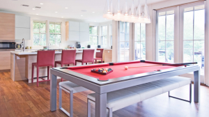
“Pool” is the modern term for pocket billiards, which is played on a table with six pockets. It earned its moniker by its presence in horse-betting establishments, where the bets were pooled and collected in what was called the pool room. The game was played by patrons between races, and the room name became associated with the game.
Billiards” is technically an umbrella term for any game played on a billiards table. This table may have or not have pockets. Today, however, what we refer to as billiards is a variety of games played on a table without pockets. A modern-day billiards table is larger than a pool table. The popularity of billiards is higher in Europe than in the U.S.
“Snooker” is played with 22 smaller balls. Its six-pocket table is the largest size of the tables for the three games, as seen here. Though popular in England and Asia, snooker hasn’t made waves in the U.S.
Table Sizes
There’s not a single standard-size pool table, but rather three common sizes. The length dimensions in the names are approximate. Although playing surface dimensions are consistent, outside dimensions can vary by manufacturer.
: 52 inches by 90 inches (approximate)
Playing surface: 38 inches by 76 inches
• Professional size/8-foot:
Outside dimensions: 60 inches by 106 inches (approximate)
Playing surface: 46 inches by 92 inches
• Tournament size/9-foot:
Outside dimensions: 64 inches by 114 inches (approximate)
Playing surface: 50 inches by 100 inches
James Grimaldi of Century Billiards says the most common residential-size table has traditionally been the 8-foot size, but he has seen a significant rise in sales of 7-foot tables in the past five years.
Note that antique table dimensions are likely to vary. Tracy Mitchell of Mitchell Exclusive Billiard Design says that a long time ago, the standard playing surface was 44 inches by 88 inches, and the table name was shortened to 4 by 8. Some people still refer to new tables as being 4 by 8, but there’s nothing that is 4 or 8 about them, and it understandably causes confusion.
Perimeter Clearance
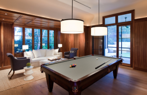
 While your designated space may fit your pool table, you also need to have ample clearance around the perimeter, as in the generously sized basement shown here. How annoying is it to miss a shot because your cue collided with a column or wall?
Sixty inches of clearance around the table perimeter is ideal for play, Mitchell says. “A standard cue stick is 57 inches, then you add 3 inches for your backstroke,” she says. “If you have 60 inches around the table, this provides the most comfortable playing area.”
But how much space do you really need, considering the table size and the clearance on four sides? I see a lot of spaces that appear too tight. Here’s what Mitchell suggests for the room size:
• Pub size/7-foot: 12 feet, 9 inches by 16 feet
• Professional size/8-foot: 13 feet, 4 inches by 17 feet
• Tournament size/9-foot: 13 feet, 8 inches by 18 feet
Noise
One possible drawback to positioning a pool table in an open loft space instead of, say, a basement, is noise. Some may find the cracking of balls and merriment disturbing in a shared open-plan space. Others see it as setting the tone for fun and relaxation, especially in a vacation home. That’s an individual decision but a point to keep in mind.
Weight
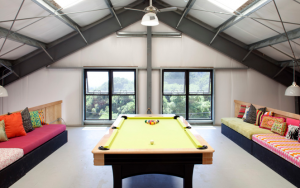
Many people set up their pool tables in the basement because it’s the room with the most available space. But lofts, attics and finished spaces over garages can be great too, especially when they’re spacious, like the one shown here. The weight of the table on an upper floor is a concern for many homeowners, however.
Although pool tables are heavy, they usually don’t require additional support bracing because the weight is evenly distributed.
Grimaldi says an average 8-foot traditional-style pool table weighs 700 to 1,000 pounds. “This is like four grown men standing a few feet from one another,” he says. Solid wood tables tend to weigh more, typically between 1,000 and 1,200 pounds. If you have doubts, especially if you have an older home, consult a specialist on whether reinforcement may be needed.
Not Enough Space?
If you want a pool table but can’t find the room for it, there’s another option. You can buy a combination dining and pool table in one. The Amarith Fusion pool table, seen here, is made with three removable leaves that create a dining surface.
Preparation Before Delivery


Area rugs. If you’re planning to have an area rug underneath your pool table, make sure it’s in place before your pool table arrives. Moving a pool table after it’s set up, even a little to put a rug underneath, will ruin the precision leveling of the table, and the table will require servicing afterward.
Light fixtures. Lighting over the pool table needs to be installed and operable before the table is moved into place. Though maintenance, such as changing lightbulbs, is expected, the last thing you want is someone standing on your table to reach the fixture to anchor it or fiddle with the wiring.
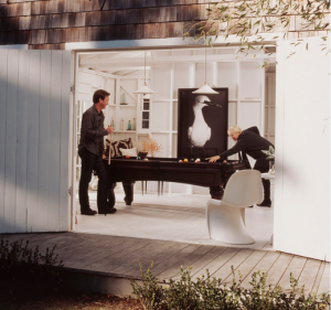
Getting it through the door. Thankfully, you don’t need barn doors. Getting a pool table through a standard-size door usually isn’t a problem, because most are assembled onsite in sections. However, if you have an obstruction such as a staircase near your entry door, it could pose a problem.
Maneuvering it into place. Here’s where navigation gets tricky. Spiral staircases and hallways with tight turns are the biggest issue. Most slate tops are 1 inch thick and made in three pieces, so turns are easier to handle. However, Grimaldi notes that his company’s high-end custom tables and outdoor waterproof tables are one-piece slates.
Thankfully, many billiards specialists offer in-home site visits to ensure that the equipment can be maneuvered through and fit in the desired location. It’s best to check rather than run the risk of its not fitting.
Light fixture selection. Pendant lamps are the best light fixture style for pool tables. “The idea is to eliminate any shadows in the play field, but also not to annoy the eye with glare,” Grimaldi says. This can be achieved with a single fixture, as seen here, as well as with double and triple fixtures, as seen in the following images.
Light fixture height. To avoid interfering with players’ heads, the bottom of the light fixtures should be 30 to 36 inches off the table surface. Since most tables are 29¼ to 31 inches high, the bottoms of hanging lights should be 60 to 66 inches above floor level.
This triple-pendant installation avoids shadows and hot spots and provides even illumination for the surface of the pool table.
Seating and beverage rails. Keep in mind the comfort of your guests. Built-in benches for seating and rails on which to set a drink are two design considerations you should try to include near the table — otherwise you risk spilled drinks and players resting against walls.
Necessary accessories. When planning your pool room, don’t forget storage for pool cues, balls, chalk and the rack. If you can, inset a holder into the wall so it doesn’t protrude into the playing space, as seen here; Grande Interiors says this one is custom made. Otherwise mount the holder on a nearby wall surface outside the 60-inch clearance perimeter if you can.
Cost
The average mass-produced pool table runs $5,000 to $10,000. However, most manufacturers also offer custom, handcrafted tables for $20,000 and up.
Lead time: Most manufacturers build tables to order, as clients choose the finishes and felt color. The lead time typically is four to six weeks. For fully customized units, the delivery time typically is six to 10 weeks.

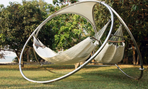 The Trinity concept is available in two models. Eternity, with its traditional shape and hexagonal roof, is reminiscent of a small garden gazebo. On the other hand, the Infinity model, which won the award at the Las Vegas exposition, explores unusual shapes for garden furniture. With its frame made of three large circles leaning toward each other, it explores the endlessly winding symbol of infinity in an ethereal dynamic.
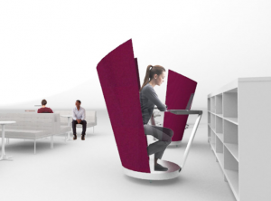 Sarah Kuchar’s swiveling First Class chair offers a none-too-subtle signal and buffer when one desires a more private environment.
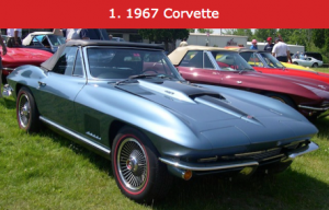 There is a short list of the most beautiful American cars and cars in the world, and the 1967 Corvette has earned an eternity-long spot on it. With ahead of it’s time molded fiberglass panels, stinger-hood, pop-up headlights, side grilles and optional bad-ass side-pipe-exit exhaust- the ’67 Corvette is not only on everyones list, but also in their dreams.
 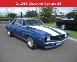 For a one year only model, no car is more beloved and emulated than the 1969 Camaro. With tough bad-boy looks and a road-race inspired stance, the ’69 Camaro displays Ponycar style with overwhelming appeal.
 After it’s iconic debut in 1969, the Trans Am was back for 1970, redesigned and ready to be unleashed on it’s prey. With a lower stance, flares and spoilers front/rear, the Trans Am was a visual definition of it’s race inspired name. Successfully combining muscular American style with sporty European flare, the second generation Trans Am’s were to become famous.
 No list of iconic American iron would be complete or even mentionable with out the Pontiac GTO on it. Ushering in the Musclcar era in 1964 with it’s tough yet sporty looks, the ’67 models were the peak of design for the 1st Generation GOAT’s. It’s long “Coke bottle” profile, dual wire-mesh grilles and center-mounted hood scoop, all Pontiac styling cues, making it one great looking car.
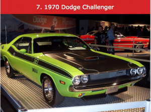 Another awesome and iconic Chrysler is the Dodge Challenger. Here donning it’s Trans Am racing colors, the Challenger shared it’s sheet metal with Plymouths CUDA. Like many of it’s contemporaries, the challenger was muscular and powerful but had a mean and tough looking stance all it’s own.
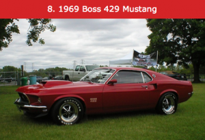 The ford Mustang single-handedly launched the Pony-car class with it’s release as a 1964 model. By 1969, Certain Stangs had crossed over to the realm of the Musclecar, like this Boss 429 example. Still retaining it’s swift moving lines, long hood, short deck, the Boss cars were beefy and stocky but violently fast-like Mike Tyson at the beginning of his career.
 Known to millions as the “Dukes of Hazard” car, the ’69 Charger combines muscular American style with tasteful flowing lines. With hide-away headlights, long hood and short sloping deck (trunk), the Charger is a classic MOPAR (Chrysler) design.
 Perhaps the most iconic American car ever produced, the ’55-57 Chevy Bel Air is synonymous with 1950’s American style. Chevrolet produced a car loaded with options and providing an appeal that any American could attain. With fins and chrome, stylized hoods and body panels, screaming modern and power, the Bel Air’s timeless design still holds true today.
 By the close of the 1950’s, American cars were making bigger and bolder statements in styling. The End of the decade Caddy’s were as big as the Warships that won WW2, and as beautiful as modern automotive artwork. Sporting mile long fins, wide white-wall tires and enough chrome to satisfy the Royal family, Cadillac was the pinnacle of American power and confidence.
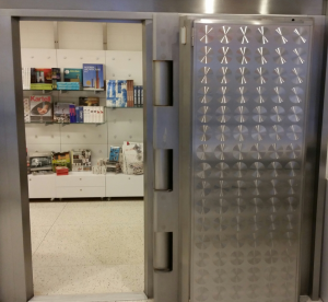
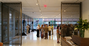
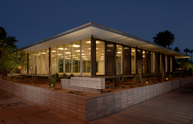 When it comes to preserving incredible midcentury icons, Palm Springs is the town that just keeps on giving. In 1961, the renowned architect E. Stewart Williams reinvented the notion of what a bank could look like when he designed Santa Fe Federal Savings and Loan as a giant glass pavilion. After sitting vacant for years, this elegant building has been transformed into the Palm Springs Art Museum Architecture and Design Center. Williams’s daughter-in-law, Sidney, was a driving force behind the renovation. “This has been a huge team effort that seemed at times unachievable,” she says. “Seeing it completed now is a testament to many creative, inspired people pursuing this shared goal with passion.” The detailed restoration was overseen by the Los Angeles architectural firm Marmol Radziner. “It was a pleasure to ensure the survival of work by a desert modern style icon and preserve part of the city’s architectural heritage,” says Leo Marmol. “I particularly appreciate how seamlessly and easily the space converted to use as a gallery. The versatility speaks to the power of simple, modern design.”


 While your designated space may fit your pool table, you also need to have ample clearance around the perimeter, as in the generously sized basement shown here. How annoying is it to miss a shot because your cue collided with a column or wall?