A Cross Between a Shed and an Office

A 75-square-foot shoffice by Platform 5 Architects was built in northwest London for about $116,000.

In prime London, $1 million will buy a home measuring just 271 square feet, according to real-estate firm Knight Frank. Simply put, space has become one of the British capital’s greatest luxuries.

Now, homeowners who have already maximized the square footage in their attics and basements are increasingly eyeing their backyards. The long, skinny gardens behind London’s archetypal terraced houses can prove difficult to landscape, yet are perfect for building anything from an extra living room to a gym, a media room, an office or a play space.

These small but high-end backyard structures have been dubbed “the shoffice”—a cross between a shed and an office.

In one example, Platform 5 Architects built a 75-square-foot pavilion for a family living in the high-end neighborhood of St. John’s Wood in northwest London.

The clients were having another child and they needed more space—the husband needed an office to work in,” explained architect Patrick Michell, a partner at Platform 5. “They had already done their house up beautifully. They are interested in art and design, and they also wanted to have something beautiful and bespoke in the garden.”

Mr. Michell designed a curved, sculptural structure and clad both the exterior and interior walls with American oak. Inside, he outfitted the space with storage and a cantilevered desk. The shoffice, built in 2012, cost the homeowners about £70,000, or $116,000.

In Canonbury, another north London neighborhood, Paolo Cossu, director of Paolo Cossu Architects, in 2011 created a contemporary space in the 111-foot by 13-foot backyard of a Georgian terraced house. The owners wanted a multi-use space, somewhere to store their vintage Porsche, an area to be used as a pottery studio and play space for their children. Despite the age of their house, they also wanted a highly contemporary design.

Mr. Cossu created a modular steel-framed building, clad in black-painted wood panels and slightly mirrored glass. When inside, it is possible to see through the windows and into the garden, but from the outside the building reflects the garden’s brick walls, trees and plants. “I like to work with reflections,” Mr. Cossu said. “The room almost disappears into the garden.”

The room is divided into two sections separated by a translucent, sliding partition. The car occupies the back portion, with direct access to the road behind. The front is used by the family. In total, it measures 430 square feet. A similar structure, if built today, would cost between $133,000 and $166,000, Mr. Cossu estimated.

While the high price of such small structures sounds extravagant, the expense is typically less than relocating to a larger house. Recent research by estate agents Savills found the average cost of trading up from a two-bedroom to a three-bedroom home in London is about $224,000. This cost rises to almost $3 million in parts of prime London.

Beyond adding coveted living space, backyard buildings can be a good investment because of the added value. Mr. Cossu notes that prices in the Canonbury neighborhood, where his project took place, are up 18.6% in the past year alone, according to government figures.

David Adams, managing director of prime London estate agent John Taylor, said shoffices make financial sense if they have been well built and furnished. Although a detached room wouldn’t be worth quite as much per square foot as space in the main house, it would command 70% to 80%, he estimates. And in prime London, home values are, on average, about $6,000 per square foot.
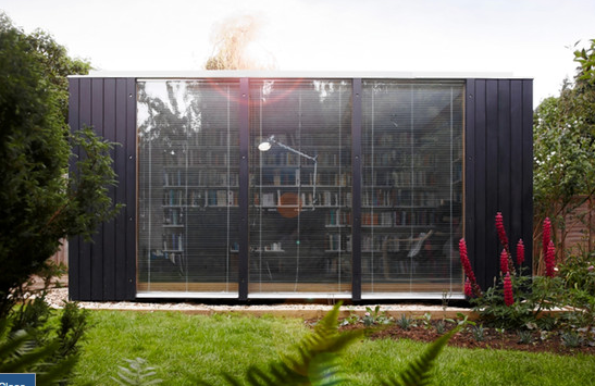
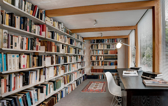
Screen Shot 2014-08-29 at 12.54.07 PMOne option less expensive than a bespoke garden room is a prefabricated design. Ben Couture, a director of the U.K.-based company 3rdSpace, offers a contemporary, wood-and-glass garden room measuring 135 square feet. Mr. Couture’s rooms typically take no more than a week to put up.

The company’s designs feature large windows and Douglas fir cladding, and have been used as everything from a private library for a university professor to offices to teen hangouts. A building of this size costs about $35,300, not including delivery, setup or utility connections.
Screen Shot 2014-08-29 at 12.54.18 PM

Homeowners considering a shoffice will find that the British planning system—considered both strict and complicated—offers a considerable amount of freedom. Generally, a structure is allowed if it doesn’t take up more than 50% of the outside space, isn’t to be used as a sleeping area and has a maximum pitched roof height of no more than 13 feet. (A flat-roofed room can be up to 8-feet high.) Anything larger would require building permits.

Meanwhile, the increase in Stamp Duty which took effect in 2012 is encouraging more owners to look at shoffices, says Mr. Adams, the real-estate agent. The levy was increased from 5% to 7% on homes worth £2 million, or about $3.3 million, or more. “If you have got a £3 million [home] and you need more space, it will cost you £280,000 in Stamp Duty to buy a £4 million home, and that is before you pay legal fees, agents fees and moving costs,” he said.

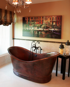
The Soaking Tub – The Height of Luxury

FIVE YEARS AGO, Tamara Kaye-Honey had a $4,000 freestanding tub delivered to the un-renovated attic of her 1920s gabled Los Angeles Tudor. “I’d brave the rickety old plank stairs, perch in the empty tub and sketch floor plans,” recalled the interior designer and mother of two. Now her newly finished master bath, with mountain views from the tub and furnishings befitting a soignée dressing room is her guilty-pleasure sanctuary. “I spend lots of time just sitting in a chair with a glass of wine reading, listening to music and maybe hiding out from my kids,” Ms. Kaye-Honey confessed.
“The freestanding tub is my muse,” she said of her modern Victoria + Albert soaker made of volcanic limestone and resin. “It gives the bathroom a sense of sophistication.”
Whether it’s a traditional design steeped in British country-house charm that recalls the less debauched parts of “Brideshead Revisited,” or a contemporary model that conjures minimalist spas, the freestanding tub has a newfound stature as the focal point in today’s more ambitious bathrooms.
Sales are approaching a high-water mark: Of designers who belong to the National Kitchen and Bath Association, more than 60% polled in a 2013 report said they ordered freestanding tubs for bathroom projects, up 7% over 2012, with their choices “trending toward contemporary and transitional styles,” rather than antique looks, said NKBA president John Petrie.
Manufacturers are hustling to meet growing demand. In 2008 the California-based Hydro Systems offered only two freestanding tubs; today it has 35 styles. High-profile designers are also testing the waters: Philippe Starck, Marcel Wanders and Patricia Urquiola have created stand-alone tubs for European manufacturers, while Wisconsin-based Kallista has introduced a line by Michael S. Smith.
Though built-in tubs are less expensive and take up less space, they don’t promote unbridled fantasy nearly as efficiently. “A built-in tub can feel a bit utilitarian, while a freestanding tub conveys the Old World feeling that relaxation is taken seriously,” said designer Timothy Corrigan, who purchased the Château du Grand-Lucé in France’s Loire Valley and grandly eliminated half of its 32 bedrooms to create bathrooms complete with original 18th-century fireplaces and historically appropriate antiques.
Sales for whirlpool tubs, once a popular indulgence, are also circling the drain. “When you have a bath, you are looking for quiet. A noisy whirlpool does not take you to a serene spa space,” said Barbara Sallick, co-founder of Waterworks, a popular source of high-end bathroom-fittings. This year, the company has seen a 13% rise from 2013 in purchases of freestanding tubs, which represent over half of its tub offerings and account for nearly 75% of its bathtub sales.

Over time, architects building new homes have increasingly seen the master bathroom not just as a glorified closet but as a room unto itself, said Ms. Sallick, who, inspired by the un-humble bathrooms in London’s Savoy Hotel, started Waterworks in 1978. “Even in older homes,” she said, “designers might borrow space from a closet or an adjoining guest room to create a private retreat with furniture, where you can imagine one person in the tub and one in a chair.”
That kind of civility—the antithesis of showering briskly while being assaulted by a firing squad of jets—was what Annie Selke‚ owner of Pine Cone Hill bedding and Dash & Albert rugs, had in mind when she converted a guest room in a Berkshires, Mass., farmhouse into a master bath. “I wanted to create a pleasing space reminiscent of English and Irish [bathrooms], which had real personality because they looked like sitting rooms,” she said. “My favorite memories of this house are sitting in the tub while my daughter sat in a comfy chair and told me about her day.”
L.A. architect Erik Evens had similar goals when he converted a secondary bedroom in a historic Pasadena, Calif., house into what he calls a “Moroccan fantasy, complete with a canopied bathtub.” In his view, “people are finding value in baths that are rooms not mere workspaces, nurturing destinations instead of clinical places.”
Of course, a bathroom big enough to accommodate a tub in its center often has room for furniture beyond a single vanity stool, increasing the scope for decorating. L.A. designer Peter Dunham, who uses freestanding tubs to echo the graciousness of British country homes, sees such spaces as more than “just a place to clip your fingernails,” and considers “sofas, area rugs, art and non-bathroomy furniture” fully appropriate appointments.
“I have begun to think of the bathroom as I do any other furnished room,” said Santa Monica, Calif.-based interior designer Tim Clarke. “The bathtub has become like a sofa; you don’t want it to feel like an elephant, so you need plenty of space. With a freestanding tub, it’s possible to furnish around it with pull-up tables, chairs and lamps.”
Injecting a bathroom with coziness creates a nice tension between practicality and geniality. “I love furniture in a bathroom because even a simple wooden chair and a vintage rug provide such a contrast to cold, hard tile and stone,” said fellow Californian designer Betsy Burnham, who recently installed a classic boat-shaped tub by the British manufacturer Drummonds in a 1920s Los Angeles home.
Screen Shot 2014-08-26 at 8.53.48 PMBecause freestanding tubs come in such a variety—cast-iron, high-backed, Victorian-style slipper tubs; Asian-influenced wooden boxes; minimalist Italian-marble troughs—they can set a more distinctive design tone for a room than built-ins, which have a clunky, cookie-cutter look, Ms. Burnham added. “The fantasy is always to be transported somewhere else,” she said. “That riad you loved on a recent trip to Morocco, a grandparents’ house in the country that’s a memory from childhood, a comfy bed-and-breakfast at the beach.”
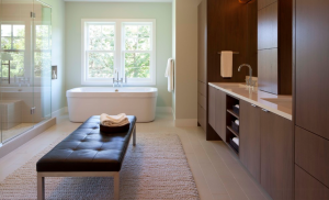
Evoking a sense of time, not place, was the aim for Charlotte Starling, the owner of Velvet & Dash Interiors in Dorset, England, when she transformed a bedroom in her 1700s house into a bath. “I wanted something that felt ‘Downton Abbey,’ ” she said, “that era when a maid would have drawn you a bath.” She selected a freestanding tub, “the longest one they had, so you could almost lie flat,” and had the plumbing routed through newly reinforced joists to the center of the room. Deviating from the conventional wisdom that the tub should be set on a water-resistant surface, Ms. Starling Screen Shot 2014-08-26 at 8.50.22 PMretained the historic wooden floorboards but also installed a practical glass-enclosure shower in the corner of the room. She painted the walls a romantic pale pink and added a Victorian nursing chair from her husband’s childhood bedroom.

The siren song of the freestanding tub also seduced design writer Kate Watson-Smyth, who installed one during the renovation of her North London home. “I love the promise of that bath. It’s the ultimate luxury, but I never use it,” she admitted. “Just the idea of it is enough for me. My husband does like a Saturday afternoon soak though.”
Though Mr. Dunham has observed that “men generally gasp when their wives want a tub that costs as much as a small car,” some guys have started to splash out. “In houses with his and hers bathrooms, we are starting to get requests for men’s tubs,” said Mr. Corrigan. “Five years ago this almost never happened.”
English artist Julian Kalinowski has always been an ardent bather. He turned a bedroom in a Georgian house in Kent into a luxurious personal statement with a claw-foot slipper tub, a sink set into a Victorian sewing table, painted wooden shutters, a table for books and a display case for vintage toys. “The fantasy was that I would lie in the bath, read a nice book, smoke cigarettes and drink champagne whilst occasionally dreamily staring out the window at the moon beyond the trees in the garden. And that,” he said, “is precisely the reality.”

BEYOND THE BUILT-IN // Stand-alone tub tips from top designers

The Costs:
Prepare to take a financial bath. Freestanding tubs can easily start at 2-3 times the price of comparable built-ins. You should also budget for additional plumbing and carpentry costs and labor. “You want to make sure that the floor is strong enough,” said Los Angeles designer Kerry Joyce, “as larger tubs full of water can easily weigh 1,000 pounds.” The fittings are also pricier than those hidden behind walls, added Los Angeles-based designer Betsy Burnham: “They’ll likely be a focal point and not only need to function well, but also look beautiful from all angles.”
The Planning:
Besides the extra space needed for a freestanding tub, which can exceed six feet in length, “you also need to consider special flooring because the area around the tub will get quite wet,” Ms. Burnham said. “Wood floors can get ruined, and large-format tile and stone can be slippery.” (She recommends 1- or 2-inch hexagonal tiles; the grout provides traction.) Consider a floor drain in case of overflows. Take advantage of a view where possible, Mr. Joyce advised: “I often position tubs in front of large windows.”
The Selection:
“The quality of enameled cast-iron is incredible, as it lasts forever, but that’s a very specific traditional look,” said L.A. designer Joan Behnke. Synthetics and stone composites are warmer to the touch and can be sculpted into more contemporary shapes in matte or glossy finishes. Metal tubs hold heat well—freestanding tubs are not typically insulated—but copper will oxidize without polishing, said Waterworks’ co-founder Barbara Sallick. For a low-maintenance organic feeling, wood and solid stone tubs have a natural beauty. Finally, be willing to take a preliminary dip to ensure comfort, said Dallas designer Jan Showers: “Clients like to get in the tubs when we’re shopping, which is a great idea.

Huntington Palisades: A bit of history

Screen Shot 2014-08-23 at 10.21.52 AMAbbot Kinney a Real Estate Developer, sold 247 acres  to Colis Huntington in 1888.  When the decision was made to establish the port of Los Angeles in San Pedro and with the death of Collis Huntington and a deteriorating housing economy ,his heirs sold  226 acres in 1926 to Robert C. Gillis.

A Canadian immigrant, Gillis was president of the Santa Monica Land and Water Company, whose large-scale land purchases set the pattern for subdivisions from Westwood to Pacific Palisades.  Honoring the legacy of the Huntington family, Gillis named the new suburb “Huntington Palisades” and planned to transform it into a fashionable upper middle-class community.

Screen Shot 2014-08-23 at 10.49.59 AMGillis chose a romantic  scheme of curved streets and landscaped boulevards.  Concentric semi-circular drives surrounded an open park are (bounded by El Cerco Place) and intersected a broad entry street with landscaped central parkways (Pampas Ricas).  The design reflected the high standards set by Gillis and Reverend Robert Scott (founder of Pacific Palisades and president of the Pacific Palisades Founders Association).  The design included elements characteristic of the Olmstead brothers, who also laid out New York’s Central Park. The elder Olmstead brother, Frederick, had come to Los Angeles to help in planning Palos Verdes and he was hired to help in designing the Huntington.

Gillis divided the Huntington into various lot sizes and set minimum construction costs.  He established rules and restrictions that prohibited property owners from using lots for other than residential purposes, erecting dwellings of more than two stories, growing hedges to more than five feet, and placing houses without regard to setback lines. Gillis extended these restrictions into perpetuity and established a property owners’ association to enforce them.

The development of the Huntington Palisades was left to Mark Daniels and W.W. Williams.  Underground utilities were installed and ornamental light fixtures were provided, costing four times the normal amount for such services.    Street names were chosen by the project engineer, W.W. Williams, who named them after famous places and people in Mexico, where he had spent much of his mining career.  Alma Real was named for his lady friend, a singer and dancer from Mexico.  Toyopa was the name of a lost mine in Sonora, Mexico.  Chapala is the name of the largest lake in Mexico.  Corona del Mar means “crown of the sea” in Spanish. The initial buyers of the Screen Shot 2014-08-23 at 10.46.27 AMvarious lots were also offered access to a three hundred foot stretch of private beach and membership in the new neighborhood association.  The opening ceremonies for the development were held on January 20, 1926.  The first home,  a beautiful 12 room colonial located at 601 Ocampo Drive,  was completed before the end of 1926 and is still standing today.
It’s a Movement: Small Spaces, Affordable, and Eco Friendly

Once you get past the size of Vina Lustado’s $40,000 house, which is 140 square feet, two things may still surprise you. One, she designed and built the house to be her home for life. “It’s not temporary. I’m never leaving,” Lustado says. Two, it’s a great place to throw parties with a lot of people. “I’ve never entertained as much as I have since I built my tiny house,” she says.

Lustado, who has been designing homes and commercial buildings for more than 20 years, has seen and designed her fair share of extravagant homes. But she’s always liked the simplicity of living in 400- to 500-square-foot apartments or guesthouses.

She eventually discovered the Tiny House movement, composed of people who design and build homes on trailer beds that are usually less than 200 square feet. She took a workshop by Dee Williams when she was with Tumbleweed, a company that helped popularize small homes, and liked the idea of living a pared-down life, the economy of using fewer materials and spending less money, and the challenge of designing a compact home that met all her needs.

Lustado spent a year — and about $40,000 — planning and building her home, which she moved into in early 2014. The home sits on a 1-acre lot in Ojai, California, that she and her boyfriend, who has his own small cabin on the property, rent for $400 a month; they split the cost.

Lustado constructed the home on a trailer rather than on a concrete foundation, which is a way of getting around many states’ requirement that any permanent living unit must be at least 600 or 700 square feet, depending on the location. The wheels technically make it a temporary housing unit and not subject to most building codes. (Lustado still followed most building codes as a safety measure.)

One of the big drivers for Lustado was to live off the grid. All the electricity comes from four batteries fed by three solar panels. A 7-gallon propane tank provides a fuel source for a fireplace, stove and hot-water heater. The only utility she pays for is water, fed to the house by a garden hose.

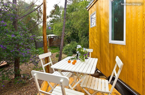
Screen Shot 2014-08-20 at 9.28.21 PMThe deck is about the same size as the living space and allows for large dinner parties. “Well, what I would call large,” she says. “You can have 10 people there, and it’s intimate and cozy. No one is having a separate conversation, because everyone is so close. It’s not supertight, just comfortable.”
The posts are from fallen trees that her boyfriend found on the property. The decking is from an old house and was reclaimed, remilled and stained. “Nothing was bought on the deck except the screws,” she says. The exterior siding is cedar.

She found the French doors on Craigslist for $200 and spent three months painting and refurbishing them to swing outward, fit the doorway and keep water out.

A path leads from the house through the woods to a shack, seen here in the background. Inside is a toilet hooked up to a septic tank. While Lustado does have a compost toilet inside her tiny house, which she disguises as a bench in the bathroom, she doesn’t use it except for the occasional middle-of-the night run, because the county doesn’t allow the use of composting toilets.

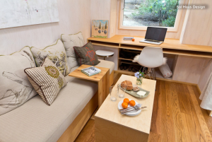
Screen Shot 2014-08-20 at 9.28.06 PMInside are a built-in desk, loft and sofa. Lustado’s carpenter friend did all the cabinetry, siding, floors and millwork. The built-ins are all made of FSC-certified wood.
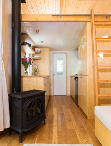
Her boyfriend trims and takes care of trees and also does construction work, and he played a vital role in building the house. “I would never have taken it on if he wasn’t able to help,” Lustado says.

But she also wanted the project to involve the community. She enlisted local artists to design things like a custom frosted glass window, draperies and pillows.

She got the oak hardwood flooring for free but paid to have it replaned, stained and installed.

The sofa has storage underneath its hemp and flax cushion. The cushion can also be used on the loft above the desk for a guest. Lustado can roll a storage piece near the desk over to the sofa to act as a dining table. She had the table that slides underneath the sofa made from leftover cedar siding.
Screen Shot 2014-08-20 at 9.26.55 PMHaving a fireplace was a priority for Lustado. She found the smallest one she could find. It cost $3,000, has a double walled flue and is remote-control operated, so she can turn it off and on from bed. “It’s superluxurious in my opinion,” she says.
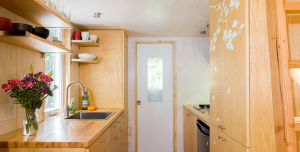
Trees on the property partially shade the solar panels, so she has to conserve her energy consciously. For example, she doesn’t use a blow dryer, toaster or any other appliance with a heating coil element, because it will blow the fuses. She could cut down the trees, but she doesn’t want to do that. In the future she will try to install her panels higher or buy more.

Screen Shot 2014-08-20 at 9.27.04 PMButcher block countertops from Ikea provide more than enough workspace. A pantry is to the right of the sink. Lustado also keeps her clothes hamper in there. She has a small refrigerator under the counter without a freezer. “I really thought about what I need, and for the amount of space that a freezer takes up, it wasn’t worth it,” she says.
The double-height cabinets with the stenciling comprise Lustado’s wardrobe closet. At the top inside is a hanging rod. Below is a custom-milled drawer and shelves. A muralist friend made the stenciling based on photographs of sycamore trees. “She specifically placed every leaf and every branch on that wardrobe,” Lustado says.

Her friend also created the same graphics on the glass pocket door that leads to the bathroom.
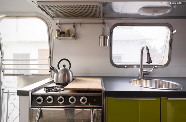
A horizontal window above the stove brings light and a sliver of a view into the kitchen.

The two-burner propane cooktop was originally designed for use in RVs. Lustado keeps a third induction burner in a cabinet underneath. A hot-water heater the size of a bread basket sits underneath this counter.
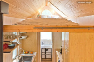
A ladder leads to Lustado’s sleeping loft.

Screen Shot 2014-08-20 at 9.27.34 PMThe skylight was nonnegotiable. “I always wanted to watch the stars from bed, so cost didn’t matter,” she says. She paid $1,000 for the skylight. It’s fully operable, and it can act as a fire escape too.
Lustado says she can take as many long, hot showers as she wants. “I never have to be conscious of hot water,” she says.

She has a storage unit in nearby Ventura that’s about 5 by 7 feet, for art supplies and other things, and she keeps some outdoor gear for camping, biking and climbing in an Airstream trailer near her boyfriend’s cabin. But she’s constantly editing down her possessions and always thinks twice before buying anything.

After seven months, Lustado feels more at home than ever.

“It’s not temporary,” she repeats. “It’s my house. If I move, it will move with me.”

Airstreams: It doesn’t matter how many you ‘ve seen they’re cool..


Who lives here?
Jordan Menzel, cofounder of CrowdHall, an online company that helps users host interactive town halls, and his 1-year-old daughter, Penelope
Downtown Salt Lake City, Utah
About 160 square feet (15 square meters)

_______________________________________________________________________________________________________________

Jordan Menzel went out for a bike ride around downtown Salt Lake City, Utah, one afternoon and saw an Airstream trailer parked on the side of the road. “A few days later, I was combing Craigslist and saw it was for sale,” he says. “While I hadn’t been planning to take on a restoration project, let alone live in an Airstream, it only took a few hours for me to commence scheming.”

The Airstream was in good condition for a 1976 29-foot Ambassador trailer, but came with all the clutter, shag carpet, wallpaper and claustrophobic curtains common to vintage Airstreams. “I picked it up for a steal in a matter of hours,” he says. “The hard part was finding a place to both do the restoration and park my home long-term. I looked high and low and landed a dream spot with a good friend. He lives in the heart of downtown and happened to have a large ‘40-foot field,’ so to speak, behind his home. After a few texts, the Airstream had found its home.”


The restoration process was slow, because Menzel ended up changing just about everything. “The happiest moment was, hands down, the first night I slept in it. Not only had I just spent a long, cold winter working on it late at night, but I had also been floating from one living space to the next. While doing the remodel, I was also in the middle of some large life changes, and finishing the Airstream was so much more than just a project. It was a symbolic gesture to myself that I still had the capacity to take on a wild idea and bring it to life. Falling asleep in this hilariously odd creation sort of put to rest all my personal struggles and allowed me to have a renewed sense of who I am and what I wanted: a simple, happy life

I suppose my style would be a mix of contemporary, vintage and elemental — steel, wood, stone — materials,” he says. “Even though I am a wildly erratic person, I hate clutter and like clean, well-organized spaces that prioritize multiuse functionality. My philosophy on decorating is that if it doesn’t serve a purpose, it isn’t necessary. I loathe decor and purposeless items in a living space. As a result, the concept of tiny homes is very appealing to me. It forces one to eliminate unnecessary items and use one’s own space to communicate personality.” Following this philosophy, Menzel used hundreds of deconstructed wooden pallets to build the closet and the cabinet around the fridge.

“The primary challenge was one of opening up the space and removing the claustrophobic feel common in older Airstreams, while expanding storage and ensuring that the day-to-day needs of a living space would be taken into consideration,” he says.

Screen Shot 2014-08-18 at 11.20.57 PM

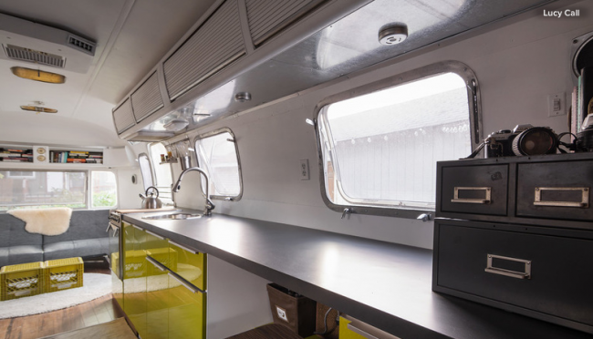
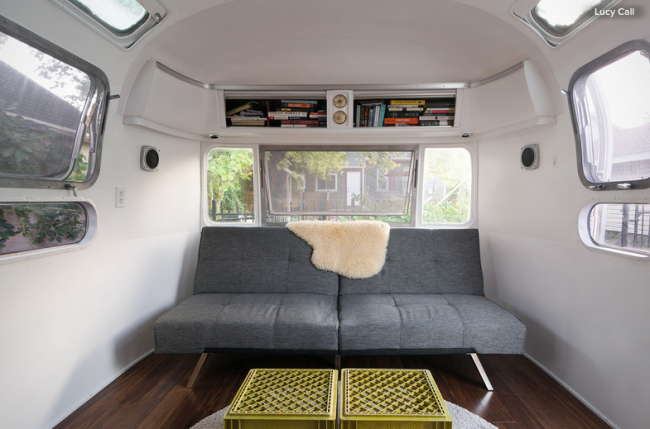
After researching many Airstream restorations, Menzel found himself annoyed that they all still had the look and feel of RVs. “I wanted to add some elements that would make the trailer look and feel more like a studio apartment and less like an RV,” he says. “One simple decision I made was to furnish the living room with free-floating pieces.” For example, the sofa bed, rugs, tables and chair can all be moved. “Given that most restorations have built-in couches and dinettes, I found this flexible living room a welcome space that allows for rearranging and a feel common in any home or apartment.”

Menzel uses the existing overhead storage spaces for his books.
Screen Shot 2014-08-18 at 11.20.28 PM

He almost ripped out the overhead storage compartments but decided at the last minute to keep them. They match the renovated space while keeping the original feel of the Airstream, and provide a lot of additional storage to keep this small space clutter free.

The desk is Menzel’s favorite spot. “I find myself spending the majority of my time eating, working, reading and writing on the little bar/desk/kitchen table I made,” he says. “It’s a simple inlet in the long counter that was almost an afterthought. However, it has revealed itself to be the most useful space I have and, as a result, my favorite.”

The challenge when taking on remodels in general and specifically Airstream restorations is knowing what needs to be completely rebuilt and what simply ought to be restored,” says Menzel. Nearly all of his Airstream was gutted and rebuilt from scratch


Menzel sought some advice on how to update the plumbing. “Trailers are tricky and have safety issues with respect to LP gas lines. A few contracted hours with an RV specialist named Drew was all I needed to get up to speed and handle the complicated issues in a safe and efficient way,” he says. The rest was done on his own with help from his father. Menzel added a composting toilet that uses moss to make the Airstream even more self-sufficient.

Screen Shot 2014-08-18 at 11.20.38 PM

“Nothing I have done trumps the original exterior,” says Menzel. “No matter how many Airstreams I see, I am still in awe at the clean, modern design that originated in the late ’50s, completely ahead of its time.”

Menzel is now improving the exterior of the trailer. Some of the updates include recaulking all the windows and seams, sanding and refinishing the main trailer frame and possibly doing a full repolishing. “These are now fun tasks that I can take plenty of time on, unlike the mad dash in midwinter to finish the inside,” he says.

Menzel loves living in Salt Lake City, since there are a lot of options for tiny-home parking, and the city is surrounded by the Rocky Mountains. “This city-mountain clash means that within minutes, you can go from downtown to isolated canyons — the perfect dynamic for off-grid living and gorgeous views,” he describes. He is planning to move with his Airstream to the San Francisco Bay Area this fall and says, “Driveways, backyards, vacant lots and alleys are all welcome.”

What to do with your sloping backyard.

We are not all blessed with an open, flat garden. Many of us live in hilly towns or the rolling countryside, and gardens on slopes are the only kinds of gardens we can get. Terraces cut into the incline are probably the most common method for making the most of those tricky sloping plots, but there are lots of ways to have fun with an uneven landscape. From snaking paths to jutting decks and sunken seating areas, here are some ideas for beautiful and exciting sloping outdoor spaces.


1. Rise above it. Constructing a deck over a steep downward slope affords level space for entertaining and great views of a garden. Depending on the angle of the slope, the deck could also be raised on pillars to create storage or even a playspace beneath.


2. Build a banked border. Most plants are just as happy growing on slopes as in level beds, so try constructing flower beds that rise up from a path, creating a green, enveloping corridor. Small steps cut into the bank will give you access for weeding and pruning.


3. Design the terraces around different themes. Terraces cut into a sloping garden gain extra style points when each is given a clear identity. Here the lower level contains a water feature, while above are structural plants that stand out against a white rendered wall. Beyond is a more relaxed planting set against black stained wooden walls.


4. Plant a living mural. If your garden slopes upward, the rear boundary will be much more prominent. Make a feature of it by creating a fabulous planted wall, as seen here. Alternatively, grow trees in pots along the wall or train climbing plants up it for a vibrant backdrop. Here strips of lawn and shallow steps with inset lights create a green carpet leading to the lush wall.


White is great but hard to keep clean.

White spaces can be light, bright and beautiful — but how do you keep them that way? If you’ve been wondering how to get the scuffs off your white floors, freshen your floaty curtains or lift jammy handprints from your lovely white sofa, we’ve got you covered.
White walls:
   •    Vacuuming walls every few weeks will help keep dust from accumulating; dust can make white walls look dingy.
    •    For a spot on the wall, first try gently wiping it with a damp soft cloth. If that doesn’t work, make a thick paste of baking soda and water and apply it to the spot, then wipe clean. If the spot still won’t come off, try a Magic Eraser.
    •    Keep a labeled container of wall paint easily accessible. Pour a tiny bit into a plastic cup and touch up discolored spots with a small brush.
White upholstery:
    •    The easiest thing to do is invest in removable, washable slipcovers. Slipcovers can be tailored to closely resemble upholstery but (hallelujah!) can be washed and bleached. Put a slipcover back on your furniture while it’s still slightly damp for the best fit.
   •    Use a stain-repelling spray to protect upholstery fabric. Be sure to check that it is meant for the type of fabric your piece is upholstered with, and test it on an inconspicuous spot first.
 •    Vacuum upholstered furniture regularly to help prevent dust and dirt from building up.
 •    A steam cleaner is the best way to get white upholstery really clean — renting or buying a machine can be far more cost effective than having large pieces of furniture professionally cleaned.
    •    Spot clean with an upholstery cleaner designed for the type of fabric you have.
White bedding:
  Screen Shot 2014-08-12 at 5.56.35 PM  •    When you choose white bedding, check the label to make sure no special care is required — you really shouldn’t have to baby your sheets.
    •    Launder white sheets in hot water with your regular detergent. Add bleach as needed to keep them looking fresh.
    •    Do not launder white bedding with any colorful items unless you are 100 percent sure they are colorfast.
    •    Quilts are delicate by nature and should never be washed in the machine. Most can safely be washed by hand in the bathtub and line dried.

White floors:
 •    Avoid wearing shoes in the house. Keep a shoe rack or boot tray near the door, along with a basket of spare slippers for guests.
 •    Put doormats inside and outside every entrance.
    •    Vacuum regularly — dirt that gets ground in will wreck your floor’s finish.
   •    Be careful about putting down colorful rugs without a backing, as some may transfer color onto your white floor.
    •    Use felt glides on all furniture feet to prevent scratches.
    •    Clean with a barely dampened mop and a small amount of gentle cleanser.
    •    To spot clean, use a cleaner designed for the type of finish on your floor.

White sinks and tubs:
   •    Frequent, light cleaning is best, because it will prevent the buildup of soap scum and stains. Trying to remove old soap scum and discoloration can be a major headache, and the harsher cleaning products and tools needed to do the job can end up harming the finish.
    •    Avoid abrasive cleansers and scouring pads, which can cause damage.
    •    If you have a vintage tub with lots of discoloration or scratches, consider having it reenameled. It’s not cheap, but it will make your charming claw-foot look like new.
White towels:
    •    Like sheets, towels should be easy to care for. Launder them in hot water with your regular detergent. Add bleach as needed to keep your white towels white.
    •    Do not launder towels with anything that has a zipper — they can easily snag on soft towel fibers, causing rips.

Academy Award Green Room Interiors

85th Annual Academy Awards®


Screen Shot 2014-08-07 at 9.30.57 AMLast year’s space was designed by AD100 talent Madeline Stuart as an elegant Art Deco–style space inspired by Hollywood’s most glamorous era, the 1930s, and legendary MGM art director and set designer Cedric Gibbons.


84th Annual Academy Awards®


Screen Shot 2014-08-07 at 9.31.56 AMAD100 interior designer Waldo Fernandez was inspired by the iconic of Hollywood decorator Billy Haines. The space included a library with entirely hand-painted book jackets that feature images from the AMPAS archives, including Elizabeth Taylor in Butterfield 8 and Sylvester Stallone in Rocky.


83rd Annual Academy Awards®


Screen Shot 2014-08-07 at 9.32.30 AMInterior designer Michael S. Smith was inspired by the 1930s and ’40s when creating his 2011 greenroom design, because it was a period of time, he says, that “really established what we think of as Hollywood glamour.” He conceived a luxe and tailored library setting, complete with a sophisticated color palette, wood-paneled walls, a gold-leafed ceiling, and comfortable furnishings.


82nd Annual Academy Awards®


Screen Shot 2014-08-07 at 9.33.14 AMRoger Thomas designed the 2010 greenroom around a custom paint-splattered floor. He says he imagined that this “would have been how the floor looked when they were painting the sets of my favorite movies.”


81st Annual Academy Awards®


Screen Shot 2014-08-07 at 9.33.52 AMStephen Shadley is a scenic artist turned interior designer to movie stars such as Diane Keaton, Woody Allen, Robert Altman, and Jennifer Aniston. Using a photographic backdrop of the Los Angeles skyline as the focal point in his 2009 Architectural Digest Greenroom design, Shadley created a lounge area reminiscent of a chic 1970s modern home with a panoramic view of the city from the Hollywood Hills.


80th Annual Academy Awards®


Screen Shot 2014-08-07 at 9.34.29 AMGeorge Clooney, Cameron Diaz, and Johnny Depp were among the guests in the 2008 greenroom, designed by Carleton Varney, president of Dorothy Draper & Co. He was inspired by Draper’s original sketches for the Beverly Hills Hotel and her 1940s design of the Arrowhead Springs Resort, which was a choice destination among movie stars and industry tycoons of that era. “I wanted to recall the Golden Age of Hollywood, where a mix of white satin, fringes, mirrors, leather tufting, and crystal were all components,” Varney says.


79th Annual Academy Awards®


Screen Shot 2014-08-07 at 9.35.15 AMWith the help of Global Green USA and the Natural Resources Defense Council, Matthew White and Frank Webb, of White Webb, designed a truly “green” greenroom: The furniture was made of sustainably harvested wood, the carpeting was fashioned out of recycled plastic bottles, and the wall covering was crafted of renewable mother-of-pearl. The space was an eco-friendly (albeit glamorous) respite for Hollywood celebrities.
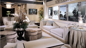


78th Annual Academy Awards®


Screen Shot 2014-08-07 at 9.35.47 AMIn 2006, veteran art director for the Academy Awards® telecast Roy Christopher and his wife, Dorothy, transformed the greenroom into an intimate yet luxe lobby of a fantasy movie theater in honor of S. Charles Lee, the prolific designer of legendary theaters.


77th Annual Academy Awards®


Screen Shot 2014-08-07 at 9.36.20 AMThe previous year, Dorothy and Roy Christopher infused the space with a deep red, black, and gold color palette to create a dramatic and theatrical yet comfortable setting. It was designed to “look like a set by interior design legend Dorothy Draper for a movie starring Diana Vreeland,” said Roy.


76th Annual Academy Awards®


Screen Shot 2014-08-07 at 9.37.14 AMRoy Christopher has had much experience designing sets for such TV hits as Frasier, Murphy Brown, Wings, and Growing Pains over the years. The set he and Dorothy created for the 2004 greenroom was a contemporary take on the Hollywood Regency style.
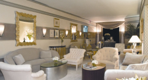


75th Annual Academy Awards®


Screen Shot 2014-08-07 at 9.37.52 AMDorothy and Roy Christopher described their design for the first official Architectural Digest Greenroom as “a tip of the hat to the glamorous settings from Hollywood’s Golden Age.” With a sleekness associated with the Art Deco era, the room matched the elegance of the stars that filled the space that evening.


Bette Midler’s Home

Bette Midler, the showbiz force of nature also known as the Divine Miss M, is spellbound by artisanal footnotes, those subtle details that are testaments to the human touch. Finely spaced stitches that secure a delicately ruffled lampshade to its metal skeleton. Fingerprints that bear witness to the intimate relationship between a potter and his clay. The poignant imperfections—smudges, saturations, overlaps—that occur when fabrics and wallpapers are stenciled or blocked one motif at a time.
“My mother was a great seamstress, really brilliant,” Midler recalls on a spring afternoon at her Manhattan residence, an airy Fifth Avenue penthouse overlooking Central Park’s sun-sparkled reservoir. “Because of her I’ve been crazy about textiles all my life. And my father painted houses for a living. I grew up around people who worked with their hands, so I love how you can see the care and affection that craftsmen pour into their creations.” Her husband, Martin von Haselberg, an investor, performance artist, and collector, concurs, explaining that he is drawn to “really juicy paintings” with gutsy brushstrokes or rugged impastos, by somewhat-under-the-radar talents such as Roger Herman, Charles Karubian, and Hubert Schmalix. “We don’t have any big names,” he adds, in a tone that’s anything but rueful. “We almost got a Francis Bacon but didn’t have the stomach to go all the way at the auction.”

Engaging textures are one reason the triplex apartment—where the couple raised their actress daughter, Sophie von Haselberg—has the coziness of a well-loved country house. Another is its Edenic wraparound terraces, conceived by Brian Sawyer of the New York architecture, interiors, and landscape firm Sawyer|Berson. Shell-pink ‘Alchemist’ roses and aubergine clematises clamber up brick walls, and foxgloves sway above emerald hostas. No peonies, though they are Midler’s favorite: Their tendency to collapse in brisk winds makes them “the worst flowers to grow on a roof terrace,” Sawyer says.
Glorious greenery has long been of the utmost importance to the Hawaii-born Midler, an ardent advocate for Mother Nature’s beneficial effects on mind and body. The New York Restoration Project (NYRP), which she founded, is a dynamic nonprofit whose volunteers revitalize forlorn parks and foster community gardens. (The NYRP has also planted, with the city’s Department of Parks and Recreation, some 834,000 trees, well on its way to the goal of one million by 2015, the group’s 20th anniversary.)

“If you live in the kind of apartment that most people do, you’d want to go sit on a park bench too,” Midler says, plainly impassioned. “I lived that way for years when I moved to New York.” Now perhaps the lifelong go-getter could also work her magic on the city’s architecture? “People suffer from the lack of light in this town,” the entertainer professes, warming to the idea. “There aren’t enough windows!”

That’s not the case at Midler and Von Haselberg’s penthouse, a mellow spot (it was once two apartments) that was remodeled by Los Angeles architect Frederick Fisher and furnished with decorator Fernando Santangelo. Sunlight streams over a chipper jumble of periods and styles, thoughtfully acquired yet casually deployed. “I don’t make a study of anything—if I fall in love with something, I want it. For me, working in many media, it’s hard to just do one thing,” says Midler, whose latest triumph was a 2013 Broadway run as the notorious talent agent Sue Mengers in the play I’ll Eat You Last.

Entranced in the past by everything from Scandinavian Arts and Crafts to what she calls “the burbling exuberance” of Memphis postmodernism, Midler created a relaxed decor when her family relocated to Fifth Avenue from Tribeca in the late 1990s. The current scheme is a highly personal environment with a watercolor palette and a fresh-scrubbed, distinctly Mitteleuropa-tinged ambience she dubs “gemütlich.”

On the main level, a floor-through containing the living and dining areas (the bedrooms are downstairs, while the library is the only room on the top floor), neoclassical Swedish painted chairs are just steps away from joyously flowered Art Deco carpets, one by Virginia Woolf’s artist sister Vanessa Bell. Lanterns crafted from what the singer describes as “crappy old kimonos” span a glazed alcove so large it is referred to as the sunroom. “We’re always right here, drinking coffee, reading the paper,” says Midler, adding that watching terns and red-tailed hawks zip past is daily entertainment. “It’s their highway, their I-95.”

Grounding the apartment’s lighthearted pastels are ebonized antiques from Vienna, a city Midler visited in the ’70s with her style mentor at the time, Alan Buchsbaum. (The architect, who died in 1987, also claimed Diane Keaton and Christie Brinkley as acolytes.) The spare silhouettes of her Wiener Werkstätte furnishings, Midler observes, are “cerebral but also romantic and homey, a little bit coffee-klatchish.” Her tufted-taffeta bedroom, on the other hand, channels Art Moderne Paris, while Von Haselberg’s raffia-and-walnut suite across the hall is simple and sober.

“We call it the German psychiatrist’s office,” his wife says in a comical stage whisper. Rigor, in fact, is something Midler dreams about. “I want to live like a monk,” she insists. “You get to a certain age and really just want to get rid of things.” When that happens, expect us to be first in line at the auction.

Award Winners – The Spectacular “Water Cube” Swimming Center In China

Engineering and design firm Arup has again triumphed with its work on the National Aquatics Centre, aka the Water Cube. For two years running Arup has received the ACEA’s top prize, with the Water Cube announced as Project of the Year at the 2008 Association of Consulting Engineers Australia (ACEA) Awards for Excellence.

In presenting the award, ACEA chief executive Megan Motto said, “It was obvious to the whole world that this project was extremely well executed to create an outstanding and iconic building.… Of particular note was the wide range of engineering disciplines brought to the project and coordinated by one firm – Arup – ensuring the work was completed on time and within budget.”

The Water Cube also won the ACEA’s Gold Award for International/Export Projects. These prestigious awards are the latest accolades in a consistent stream of recognition this iconic building is receiving, coming just days after it was awarded the Sir William Hudson Award, the highest honour at the Australian Engineering Excellence Awards.

In 2003, Arup, PTW Architects and China Construction Design Institute (CCDI) won an international design competition to create the Water Cube. Over the intervening period, a range of Arup disciplines contributed to the project’s ultimate success at the Games. The swimming pool performed as one of the fastest yet produced, with excellent line of sight for spectators, and the diving venue was acknowledged as being second to none.

Arup’s contribution to the project was extensive. The Sydney-based Arup engineering team led the way, integrating more than 100 engineers and specialists spread across 20 disciplines and four countries.

The project was fast-tracked, with delivery of the design, from competition stage through to a fully approved scheme, taking just 12 weeks. The aggressive program continued through to the official opening of the Water Cube in January this year.

According to fire engineer Dr Marianne Foley, “Timing was an enormous challenge but Arup’s one stop shop (multidisciplinary) approach enabled us to cover all of the engineering and specialist design roles throughout both the concept and scheme design stages.”

“The end date was obviously non-negotiable, yet all of us faced unanticipated issues arising from the unique nature of the project. We had to find solutions to multiple unprecedented challenges without taking any additional time.”

Dr Foley was in the thick of all this, as she was dealing with the unconventional ETFE cladding while developing an overall fire plan that convinced the local authorities to accept a fire design outside Beijing’s conventional building code.

Design leader Tristram Carfrae says there is widespread acceptance that the Water Cube marks a new beginning in design thinking, by challenging established ideas of what a structure should or could be. This new thinking, he says, is the consequence of asking the question, “How does structure fill space?”

“Traditionally, structure is all to do with forms and services, such as beams, slabs and columns. In big roofs, structural engineers have explored the idea of manipulating the shape to enhance the structure, such as arches and domes. Sometimes we have experimented with separating the structure from the shape of the thing it supports. For example, the cable net supporting the roof of the stadium is not the same shape as the roof itself.”

“Previously, structure was viewed as a surface. But in nature, structures that fill space are a regular occurrence, such as the crystals that combine to form rocks. This idea informed the design of the structure that is the Water Cube.”

Later in the project, the team had to seamlessly hand over the design to their Chinese design partners for detailing, while ensuring that technical approvals were secured and that the innovative design was understood, accepted and constructed safely.

According to project manager Rob Leslie-Carter, “The Water Cube also became a bridge for cultural exchanges. Through it we deepened the understanding, trust and friendship among the project team members and stakeholders from both Australia and China.”

“This was only achievable by establishing and maintaining absolute clarity of the design vision, communicating that vision to project stakeholders with differing cultural expectations, and the outstanding collaboration between Arup, PTW Architects and CCDI.”

In the short time since its opening, the Water Cube has become an icon of a ‘new Beijing’. The venue amazed visitors and inspired athletes at the 2008 Olympic Games, and has left a lasting legacy for Arup, the project stakeholders and the people of Beijing and China – a world-class, sustainable aquatics centre made from a box of bubbles.

To date, the Water Cube has won:

  • 2008 Association of Consulting Engineers Australia (ACEA) Awards for Excellence, Project of the Year and Gold Award for International/Export Projects.
  • 2008 Australian Engineering Excellence Awards, Engineers Australia, Sir William Hudson Award.
  • 2008 Engineering Excellence Awards, Engineers Australia (Sydney Division), Bradfield Award and Excellence Award for Buildings and Structures.
  • Institution of Structural Engineers (IStructE) Structural Awards 2008, Award for Sports or Leisure Structures.
  • 2008 Australian Institute of Project Management National Awards, President’s Award for Best International Project.
  • 2008 Australian Institute of Project Management NSW Awards, Construction/Engineering category winner and award for best project across all categories.
  • 2008 UK Association for Project Management Awards, Overseas Project of the Year.
  • 2006 Popular Science magazine’s “Best of What’s New” Awards, Grand award for engineering.
  • Official Awards of the 9th International Architecture Exhibition, La Biennale di Venezia, Atmosphere category winner.